Getting The Most From Twhirl
I’m a Twitter user, but it wasn’t always like that. The problem is, Twitter really only seems to be useful if you have a Twitter client. The web site interface they provide is cumbersome, and if you’ve only used it over SMS or IM, you’re missing out on a far richer experience.
I started out using Snitter and really liked it, but there were a few features missing (like the ability to follow someone right from the client) that I wanted, so I tried twhirl. It’s pretty cool. The only thing I didn’t like about it is that you have to customize the defaults a bit to really get the most out of it. Here’s what you have to do to get the most from twhirl:
Turn off “prefix tweets with sender’s name.” This is in the configuration, on the “Visual” tab. The sender’s name already appears in some smaller meta-text below each post, so prefixing the tweets with the sender’s name just eats up screen space.
Turn off “mark received tweets as new.” This is also in the configuration, on the “Visual” tab. Unless you follow less than 10 people or you have more time on your hands than you know what to do with, you’re probably not going to be reading Twitter the same as you read email. Twitter is like standing in a convention hall where everyone is talking to everyone else. You’ll probably miss some tweets, you might hear bits and pieces of a conversation, and that’s OK. Turning this option off will stop you from seeing an annoying little “light” on each tweet you haven’t read.
Set the opacity to 100% when inactive. Again, in the configuration, on the “Visual” tab. It’s really annoying to have a 65% opaque window scrolling tweets when you’re doing something else. It’s like seeing something in your peripheral vision that you can’t quite get to focus. Turn this up to 100% so there’s something concrete to glance over to when you’re working on something else.
Customize your color scheme. This can be as easy or as difficult as you want it. The default aqua sort of color scheme is just painful. You can very easily select a new color scheme from the Accounts window on the “Colors” tab. I recommend one of the black schemes, but check it out and you can see a little preview image of each one and choose your own.
The other option you have is to create your own color scheme. As of version 0.7.5, this isn’t an “officially supported option,” but it’s still simple.
To create your own scheme:
- Go into the twhirl “colorschemes” folder (C:\Program Files\twhirl\colorschemes) and you’ll see a bunch of XML files in there. The names of these files roughly correspond to the names of the available twhirl color schemes.
- Find one that is reasonably similar to what you want yours to look like and copy it.
- Rename the copy to a short/small version of the name of your new color scheme - for example, if your color scheme is “Navy Blue” you might call the file “navyblue.xml” or something.
- Open the copy in a text editor. The XML is pretty self explanatory. Read through it to familiarize yourself, then…
- Update the <title>, <version>, <author>, and <date> information. The title is what will appear in twhirl.
- In the <colors> section, you’ll see all sorts of available options. The value in each tag is a hex color number. Use a hex color picker or your favorite paint tool to update the colors.
- When you think you have it right, save your changes and exit twhirl. Make sure it’s not running - just closing the chat or the accounts window won’t do it. You have to click “Exit twhirl” from the accounts window.
- Restart twhirl and switch to your new color scheme. If you need to make adjustments, switch to a different color scheme before exiting twhirl. (I had trouble where it seemed to cache the previous color scheme values if I didn’t do that.)
When I created my custom scheme, I wanted to address the following issues:
- Easy readability - I’m not a dark-background-light-text person, so I picked a white background with black text.
- “Standard” link color - The web has sort of conditioned people (me) to think link == blue. Not creative, but I don’t have to think about what’s clickable and what’s not.
- Ability to locate relevant tweets - I want to easily be able to scroll through and find tweets from me and tweets to me (both replies and direct messages).
- Nothing too ridiculously garish - I was limited a bit by the inflexibility of the theme options, but basically I tried for something that wasn’t, like, “high contrast” or something overtly offensive to my rods and cones.
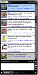
My custom scheme looks like this:

And you can download it here if you like. (Unzip the file into your twhirl colorschemes directory. The XML file inside is the color scheme.)
Overall, twhirl is pretty good. Snitter is a little better from a style flexibility perspective, and if it gets updated to have some of the features I like, I’ll probably switch back. On the other hand, if twhirl can give me some additional style flexibility, I’ll be totally won over.