pInvoke.net
I’m sure I’m the last person even finding this bandwagon to jump on, but this has to be the coolest thing since cool things: pInvoke.net and its associated VS.NET plugin.
Because there’s no reason to learn C++ if you don’t have to.

I’m sure I’m the last person even finding this bandwagon to jump on, but this has to be the coolest thing since cool things: pInvoke.net and its associated VS.NET plugin.
Because there’s no reason to learn C++ if you don’t have to.
NOTE: Something you may be interested in is the Command Prompt Here Generator.
I got a comment on my Solvent entry about how a VS.NET command prompt would be a handy thing to have on the right-click menu.
I guess I assumed everyone developing had already fixed their default command prompt so it’s ALWAYS a VS.NET command prompt. I find I have little use for a command prompt that doensn’t have all of the VS.NET environment stuff set up on it.
For those who haven’t, and figured it’d be nice, here’s the registry hack that will automatically run the vsvars32.bat file when you get a command prompt. Note that there is a similar article out there advocating the use of the “/k” option to run the file. I don’t use that; instead, I use the “AutoRun” registry key so regardless of how you access the command prompt - even if you do a Start -> Run and type “cmd” and click OK - you’ll always get a VS.NET command prompt. (It’ll even fix it so if you have the Command Prompt Here power toy installed, that command prompt is a VS.NET command prompt, too.)
It looks like this:
Windows Registry Editor Version 5.00 [HKEY_LOCAL_MACHINE\SOFTWARE\Microsoft\Command Processor] "AutoRun"="\"%VS71COMNTOOLS%vsvars32.bat\""
Or you can download a text file with that already set. Rename it to have a “.reg” extension, then merge it with your registry.
I just got sucked in to a four-hour-long meeting tomorrow.
I’m not a big meeting person. I have about a 30 minute (tops) attention span at meetings, regardless of my level of involvement in them, so after about half an hour I’m ready to check out - I’ve lost all interest in whatever topic it is and I’ll pretty much say or do whatever it takes to get out of the meeting.
On top of that, I’m a firm believer that good results are rarely achieved by meetings. Sure, there are a few good meetings that happen, but by-and-large, going to a meeting is like convening a congressional hearing - it takes forever to hear all the sides to every story, and then some arbitrary decision is made by committee that I really don’t care about.
I just don’t do well with meetings.
So I’m not too thrilled about being called into a four-hour-long meeting. I think that’s probably why I’m not in management and my career could potentially be considered “limited” - I want to focus on doing, not planning to plan the plan.
It really doesn’t help that the meeting is about the next phase of this project I just got off of that burned me out 110% on web development of any nature. I was starting to get my groove back, and I even put a couple of cool things (what I think are cool) out here for folks to download and use… I was starting to feel that desire to create cool stuff again.
There goes that. And I was just starting to enjoy myself.
I guess the best I can hope for now is to die in my sleep. Or at least not have unreasonable deadlines on the stuff I have to get done (which is, I think, the aim of the ridiculous four-hour meeting).
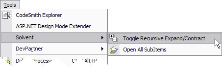
Solvent is a set of simple but effective tools for Visual Studio .NET 2003 packaged as an add-in. Why call it Solvent? All the tools work in the Solution Explorer.
Bad science puns aside, here’s a list of what Solvent provides:
Solvent adds itself to the Tools menu and to the context menu for items in the Solution Explorer.
Tools Menu:
Context Menu (On a Project):
![Solvent [Project] Context
Menu](https://www.paraesthesia.com/images/20040625solventcontextmenu.gif)
It’s free, so come and get it!
Installation Note: Be sure to shut down Visual Studio BEFORE you
install! If you don’t, you may see the UI elements of the add-in
disappear. If you install the add-in and find that the UI has
disappeared (and this goes for ANY add-in), go to Start -> Run and
enter:
devenv /setup
That will reset your menus and force add-ins to rebuild. You may lose
any customizations you make to the standard menu bars, though (like
adding/removing buttons on bars). I’ll add a check for VS.NET on install
for the next release.
NOTE: Gaston Milano has a similar product for VS 2005 called CoolCommands. As Solvent does not support VS 2005, you may be interested in checking that out.
Version History:
The more I work in tech, and the more I write in this blog, I’m finding that I write more about work/tech stuff and less about what I’ve been up to. The thing is, what I’m usually up to is tech stuff.
I’m not sure how my readers feel about this (or even if I have any readers other than the Google search bots) because you gang out there don’t comment. Not that I’m soliciting comments for comments’ sake, mind you, I’m just sort of going by intuition here.
I’m pondering the idea of splitting out my tech-related stuff into a fully separate blog. That would allow the folks coming for the tech to see what they want and the folks trying to keep up with me personally to see what they want, ne’er the twain shall meet.
Again, though, the problem is that what I’m usually up to is tech, which means the people who want to know what I’m doing should probably just assume, should I split the two, that I’m simply busy with work things that you really wouldn’t care about.
Any opinions on that?
I’m also thinking of creating a more static “downloads” section for the little programs I’m throwing up here. Not that I think I’m going to have some massive load of software to download, but I figure it might make it easier for the folks coming for the downloads to have a nice, central spot that has the latest info in a less bloggy format.
Questions? Comments?